Test little and often
Watching people use your website is an enlightening and humbling experience. It is also essential, if you want your site to be as intuitive as possible.
Don’t think this means you need to hire expensive consultants to organise formal sessions, though. It’s much better to test two or three people at a time throughout the development cycle than to have a big feedback session just before the launch.
Why getting feedback is crucial
- Improving usability is an iterative process. If you test with two or three people early on it will immediately be clear if people can’t see a button or can’t find a menu item. You can fix this and then in the next round of tests your users will get past those issues and find the next round of issues. If you left the testing until just before the launch and got thirty people in a room to test the site, most of them would be stuck on not finding the button or menu item, and you wouldn’t get a chance to fix the problems further on in the site.
- You need to verify you are on the right track. The longer we work in a particular domain or organisation, the more we become a frog in a well. We assume the language we use is intuitive, and the knowledge we have is widespread. This is one way we fall prey to false consensus. We need to verify that the language and the structure of the site is intuitive, and that its interface is as easy to use as we think it is.
- Users have brilliant ideas. If you can’t think what to call a group of pages, or you can’t decide where to put some content on the site, then don’t be afraid to ask your users. They often come up with fabulous ideas about how to organise and design your site.
- The key to commitment is involvement. If you ask for people’s feedback on a site, you are showing them that you value their opinion. This makes them take more of an interest in the site, and more likely to give feedback in the future. If you get feedback within an organisation, then talk to the people who normally don’t get asked their opinion, like the people lower down the hierarchy. These people are often less immersed in jargon than the management, and they are usually more customer or user-facing, so they are more familiar with what users are interested in.
Case study: putting users over gurus
In 2013 I was working at King’s College, Cambridge, and redesigned their website. I read a blog article by a fairly big name in web development, who said “If you work on a university website, then use the label ‘Admissions’ for the information about applying to the university. This is the standard term now.” I didn’t think a lot about it because we already used the term “Admissions” in our site menu.
Then I did a card sorting exercise where I made cards for each page or group of pages on the site, so I had cards for things like “News”, “Library” and “Undergraduate Study”. Then I asked people to group the cards into categories, and give each category a name.
One person was stuck on a name for the admissions informations, so I said, “Would ‘Admissions’ work for you?”
“No, that wouldn’t work at all,” she said. “That would mean admissions to the chapel.”
I was stunned: of course it could mean that! I’d never realised that. This shows the huge value of feedback. It only takes one person to point out something you didn’t think of, but when it’s mentioned it’s obvious.
It also shows that it’s better to base your decisions on what your users find intuitive, rather than what people who haven’t spoken to them say they will find intuitive.
Who to ask for feedback
Ideally, ask people from the target audience you identified in your strategy, but even a friend or a colleague not involved in the project is better than no-one. Anyone will notice that you can’t find a menu, even the non-target audience.
The worst people to ask are the ones familiar the project, and the ones steeped in the organisation’s jargon (typically senior managers).
If you get feedback from someone with strong opinions, and who states authoritatively that “you need to do this” and “people won’t like that”, then be sure to balance their feedback with someone less opinionated. The most opinionated people aren’t necessarily the most representative (see Beware false consensus).
Case study: the CAF bank relaunch fiasco
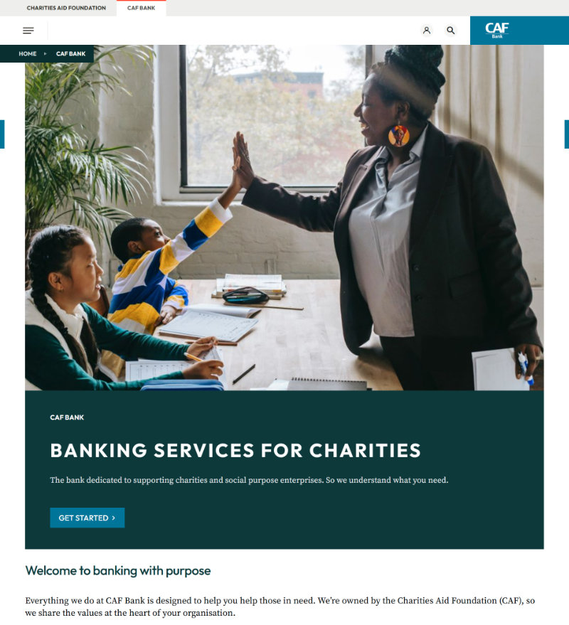
In the UK there is a bank called the Charities Aid Foundation (CAF) Bank. It is a bank used by charities to deposit their money and make payments. In June 2025 it relaunched its online banking service and website.
Within a week they had so many complaints they had to close their phone lines, and then take down the website. Although many problems concerned the back end system not working (e.g. payments not going through), the front-end website also had issues. Examples include:
- Unfamiliar symbols. Some people couldn’t find the main menu because it was a three-line hamburger menu under the logo, not at the top of the screen. In addition, the three line were unequal length so it looked like a paragraph symbol in Microsoft Word.
- Inconsistent terminology. On some pages a transaction was called a “transfer” and on others the same transaction was called a “payment”. What’s worse, these are different things (a transfer is when you transfer money between your own accounts, and a payment is when you pay an external party).
- Inconsistent dialogue boxes: in some screens the positive options like “Yes” and “Continue” (versus “No” and “Go back”) were on the left side of the dialogue box, and in other screens they were on the right.
- No system feedback: if you tried to submit a form without filling all the mandatory fields then nothing happened. There was no error message to help.
Clearly no-one had watched a customer use this site before it was launched. Anyone interested in what customers said about it can look at their comments on TrustPilot.
How to get feedback
Informal chats
Feedback is an ongoing process even after the launch of your site or new feature. Get all the feedback you can. Ask people at meetings meetings, conferences and chats with colleagues how they find the website. Did they find what they wanted? Is it easy to use?
Informal test sessions
Every now and then, ask someone if they will test your site for you. This is especially important when developing a new site or feature. Tell them you want to watch them do a task and give you some feedback on how easy it was. Emphasise that it won’t be a test of them, but of the website.
I say this because some people say, “Oh, it’s no use asking me about websites. I don’t know anything about them.” They have the impression you want to test them, not the website. Tell them that if they have problems on the site it’s not their fault, it’s the site design.
Sit by them, or if you’re virtual then ask them to share their screen. Ask them what they have done on the site in the past, or what they did the last time they visited the site. Then ask them to show you what they did, and talk through their thoughts. It’s important they keep talking and keep telling you what they expect to happen next and what they think of the page they’ve just landed on. Was it what they expected? Is it clear what to do next?
If you are testing a particular feature like an application system, then of course you can make the task more focused and ask people to go through that. Again, ask them to tell you what they’re thinking as they go through, and don’t give them any guidance. If they’re stuck or confused, then ask, “What are you thinking?”
Be sure to take notes of the feedback. Compare the notes you take from different users and pick out the common themes. These hint at something you probably need to change.
Formal sessions with a UX person
If your organisation has User Experience (UX) people then ask them to help you. If not, and if you have the money, then you can hire UX consultants to conduct tests for you, or even just give you advice about how to conduct tests. Be aware that if you want them to test some users you will have to supply the names and contact details of volunteers. They don’t usually find users for you, or have any on their books.
Test without a design
If you are developing a new site, a site redesign or new feature, don’t wait until close to launch before testing. You can test even before the site is coded or has a design. For this, you can use “wireframes”. These are simple drawings of a web page (on mobile or desktop).
You draw a rectangle to represent the screen and then simple shapes to represent page elements. Horizontal lines represent text, boxes with a cross in them represent images and button shapes represent buttons. The important thing is to put in the main text links, so people can see where you can go and what you can do. This also allows you to test if the words you are using and the structure of the site is intuitive.
You can get special software to make wireframes, but you don’t need it. You can just draw them on paper or in PowerPoint/Google Slides. The advantage of slides is that you can put links in to other slides, so the slides can work like webpages, where you can journey from one wireframe to the next.
Wireframes remove distracting discussions about graphic design and let you focus on the essentials: how people will do what they want to do on your site or app.
A note on questionnaires
By “feedback” I don’t mean online questionnaires. I mean talking to someone in real life and watching them use your site. When someone visits your site or app this is a small chapter in a story of their life. They were doing something before they arrived on your site and they’re going to do something after.
Questionnaires are like web stats in that they don’t tell you the entire context of why someone is on the site. They don’t let you see how people use the site and how they feel about it, and its less likely you will get helpful suggestions from users, suggestions that arise as a result of just chatting about the site.
More about UX
The Nielsen Norman Group have many useful articles and videos on UX design, including a usability testing 101.