Don't skip the strategy
The basis of a good site is understanding why it exists. Here are four questions to ask:
- What do you want the site to do for you?
- Who are the users and what do they want?
- What is unique about your site?
- What content and features would give you what you want, the users what they want, and provide a unique experience? This brings questions 1-3 together.
You might think, “Wait, I don’t want to answer boring questions like that. I just want to get to the exciting bit of making a website.” But you will answer questions 1 or 2 whether you think about them or not.
Every time you decide, “We need this content on the home page” or “That content has to be more prominent”, you are answering the questions of what’s important to you and your users. You will just answer the questions unconsciously rather than consciously. This means your answers will be inconsistent since they will depend on what seems a good idea to you and your colleagues at that moment, which might vary from meeting to meeting.
By writing down and agreeing on the answers to questions 1-4 you will get a consistent basis for decision making, and the site will feel more coherent.

The overlap between what you want and what your users want (questions 1 and 2). Ideally, this overlap will be big and you can spend most time developing content and features in this area.
Outside the overlap to the left you have things that you want to promote, or are obliged to include, but which most of your users aren't interested in (funding acknowledgements, legal statements). To the right we have features or content your users would like to see but which you don't have the time, budget or expertise to offer.
1. What do you want the site to do for you?
What would you like people to do on your site? Do you want them to contribute to your project, post about it on social media or join your organisation? Think of how your website can best help you. Convert those things into goals and put them in order.
Case study: Card sorting the goals
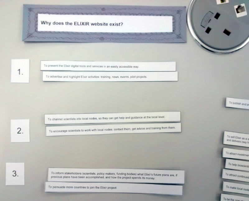
I once worked for an organisation where I asked stakeholders what they thought the goals of the website should be. Each of them gave me four or five things they thought were important. What struck me was how different they were!
The organisation already had a strategy document with its objectives, but people had different interpretations of these objectives.
I wrote the website goals people had suggested on cards, and got the same people to sort them in order. This allowed them to see suggestions they hadn’t thought of, and allowed me to average out what the stakeholders felt were most important. We arrived at the top three goals of the site.
It’s important to get this clarity on why the site exists because it helps you prioritise content and features. If you don’t have a common understanding of the site’s goals, you’re more likely to get disagreements and an incoherent site.
2. Who are the users and what are they looking for?
In question 1 we looked at what the website or app should do for your organisation. Now we look at what it should do for your users.
People visit a site for different purposes. What are these purposes? Make a list of them and take all the opportunities you can to ask your users why they they use your site. Don’t assume you know all the reasons. See if you can whittle it down to four or five main reasons.
You might find that some users are looking for specialist information, whilst others are looking for general information. For example, if you run a scientific project there may be scientists who want all the technical details, and members of the general public who just want to know what the project’s about and why it’s important.
If you put the technical details on the home page, then the chances are the general public will leave. If you want to appeal to both audiences, then prioritise the more general one. Put accessible information on the landing pages to draw people in, and link to specialist, jargon-filled information deeper in the site.
3. What is unique about your site?
Why should people visit your site rather than a similar one? It’s worth looking at the websites of similar and competitor organisations. Notice what they offer, what labels they use on their site, what sections the site has, what colours and imagery they use.
Note down ideas that might be useful for your own site, and what ideas to avoid. You can make a spreadsheet with columns like: “Name of site”, ""Main sections”, “Good ideas”, “Things to avoid” and “Notes”.
If you are creating a new site for an organisation or project, this exercise will tell you things like what colour schemes your competitors use, and so which ones you should avoid.
Don’t forget to look at sites in other domains and countries. If you are planning a site for a local wildlife project, for example, then look at local wildlife project sites across Europe, Canada or the US, as well as the more obvious ones in your own country.
Thinking about why your site is unique will help you when it comes to Search Engine Optimisation (SEO). This will be the subject of a future article.
Case study: Benefits vs descriptions
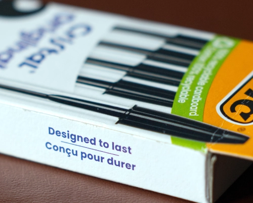
In a physical shop or supermarket the products come in packets or boxes with a phrase to express their benefits. That’s because you sell on benefits, not descriptions.
For example, on my desk is a box of cheap Bic biros. The box has one strapline: “Designed to last”. Bic have done their research and realised people fear that a cheap biro will stop working quickly. Bic have put their most important benefit up front: these biros will last.
They haven’t said, “These biros contain uniquely formulated ink” or “They are made of industry-standard hardened plastic”. These statements don’t say how the pens benefit the user.
A website is like the box around the organisation. What would you say on your box? It is common, especially in academia, to describe things: “We have 87 services running in 12 different countries”, “We work with over 15 institutes”…but why should anyone care? When thinking about how you are unique, think of unique benefits to people, not numbers and descriptions.
4. What content and features would give you what you want, the users what they want, and provide a unique experience?
This is where you bring questions 1, 2 and 3 together. There may be some things you need to include on your site that most people aren’t interested in, like legal information or funding acknowledgements. Often, though, there is an overlap between what you want on the site and what the users want to see.
Is the site mostly information pages or is it going to be interactive (like an app)? Do you need a log-in area, a shopping cart, or a database of people or products? How can you do this in a way that is unique and memorable for the user?
Make a list of the features you require, and roughly how many pages. If your site will be more app-like, what will people need to be able to do?
Going forward
Once you have a short document (less than two sides) with these four topics on, then you can use it as a basis for decision making. Remember that the document is a living document. Answering the questions above is an iterative process where you are continuously refining exactly what the site needs to do, who the users are and what they are looking for.
Case study: Designing the Google home page
Imagine that Google had forgotten to create a home page. They say to you, “Look, this is really embarrassing, but do you think you could get a committee together and design a home page for us?”
So you assemble a committee at your workplace and get going. You think about all the products Google has: the search, maps, Gmail, Drive, YouTube, Chrome, Gemini, Docs, Android, and so on. Then you design the home page.
Now here’s the question: what is the probability your committee will design a home page that looks like Google’s actual home page at https://www.google.com/? I’d guess it’s close to zero.
Why? Well, I guarantee there will be at least one person on your committee who hates white space. They will view the page like a pizza base that you need to cover everywhere, to get the best value out of it. But apart from that, why wouldn’t it be the same?
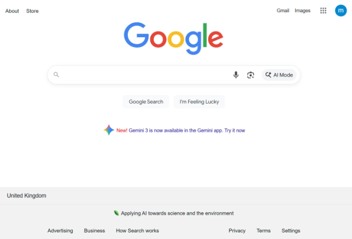
Here’s a thought: it’s because your committee does not have a clear enough idea of the main purpose of your organisation, and is not ruthless enough about prioritising this purpose. To help you prioritise your content and features, ask yourself, “How would Google design my home page?”